This Week In Vexillology #257
You know what I'm starting to realize? Canada has some really good flags. No, seriously. British Columbia is somewhere in my personal top ten list of all time favorite flags and a couple of provinces over, the more I look at the flag of Saskatchewan, the more I like it. Check this sucker out:
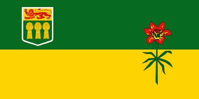


Adopted on September 22nd, 1969 after a province wide competition that brought in over four thousand entries, Mr. Anthony Drake of Hodgeville, Saskatchewan created the winning design. And to be honest, there's a lot to like about it. There's a minimal amount of colors (I know professional vexillologists out there get all up in arms about 'too many colors! there's too many colors!' but it doesn't necessarily bother me all that much.) and the design is minimal as well. A horizontal bicolor with two symbols on it makes this flag look pretty sharp.
Let's break it down. The coat of arms was granted first as just a shield by King Edward VII in 1906, the rest was requested by the province for their Heritage Year in 1985 and granted by Queen Elizabeth II the following year in 1986. In a wise design move, they just put the shield on the actual flag, which dovetails nicely with the colors without the added business of the beaver, the lion, the deer and the motto mucking it up. The shield itself is a lion passant- usually, the default colors are gold with red tongues and claws, but interestingly enough, on a gold field, they're red with blue tongues and claws, which is far more noticeably on the actual coat of arms than the flag. (I think it's there, but you have to squint. A lot.) Below the lion, you've got three gold sheaves of wheat that represent the agriculture of the province and the heraldic sheaf of wheat has pretty much become a symbol of the province itself.
In the fly of the flag, you've got the western red lily, the floral emblem of the province. The upper green half of the flag represents the forests of the north, while the lower golden half represents the prairie wheat fields of the south of the province.
In general, I think this is a pretty cool flag, but it could have been cooler. In 1964, for the 60th Anniversary of the Province, another competition was held to design a flag for the occasion and Sister Imelda Burgart of St. Angela's Convent at Prelate was selected out of 241 entries and she came up with this:

This flag was flown through the Centennial celebrations of 1967 and supporters were actually hoping it would become the actual flag of the province and it's easy to see why. The use of the shield and the horizontal bicolor remain, but the cool part to me is the stylized sheaf of wheat. I've got nothing against the western lily as it looks pretty cool as well, but the stylized wheat? Man, that's on another level.
The symbolism is also pretty similar to the current flag. The red stands the fires that once ravaged the prairies, the green stands for agricultural cultivation and life, the gold stands for the wheat fields.
Both of these flags are, in my book, pretty damn cool. Good job, Saskatchewan!
Remember, until next time, keep your flags flying, FREAK or otherwise!


Comments
Post a Comment