This Week In Vexillology #237
I was wondering what I was going to do this week, but then The Quiet Man tweeted a picture of the shiny new flag of Toronto he purchased on his trip to the Great White North and inspiration struck- the one type of flag that I haven't done too much of yet? City flags. So, This Week in Vexillology, thanks to this handy-dandy Buzzfeed listicle I found, we're going to look at a trio of City Flags.
First up, Buffalo:
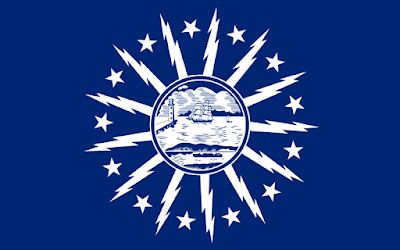 First of all, how bad ass is this flag? It's like someone took the old 'seal on a bedsheet' thing and decided, 'LET'S ADD LIGHTNING BOLTS!' and this is what resulted. The flag immediately catches the eye. There's not too many colors- though the combination of navy blue and white seems a little vanilla to me, I think it's probably a wise design choice in this case. You've already upped the ante with the lightning bolts and that's where you want to focus of the design to be- if you start adding colors, this thing could have turned into a hot mess real quick.
This flag has been the flag of Buffalo since 1924. According to the flag's wiki-page, they originally had a contest in 1922 to design a new flag, but didn't get enough entries or entries they liked, anyway so they upped the reward money and local architect Louis Greenstein, who produced the winning design, won himself a cool $250.
So, what does it all mean? Well, the central emblem features a ship passing a lighthouse (I'm assuming on Lake Erie) at the left of center and below that a canal boat on the Erie Canal, representing Buffalo's geographical location and connections to the bodies of water. The thirteen stars in between the bolts, represent New York's status as one of the Thirteen Original Colonies and the bolts represent either 'the energy and zeal' behind the spirit of Buffalo or they celebrate Buffalo as one of the first cities to deploy electricity widely.
Next up, Toronto:
 Seriously, how cool is this flag? To be fair, I found some detractors online that suggested some interesting look alternatives, but as city flags go this is pretty good, at least to me. It was originally designed by Renato De Santis in 1974 for the Old City of Toronto flag design content (at least per the flag's wiki-page) and when the city consolidated in 1997 with the surrounding metro areas (which I honestly didn't know it did, so the more you know I guess!) they looked for new flag designs, but didn't find any they could get behind so just fiddled with the original a bit and landed on this design in October of 1999.
The white stripes represent the outline of the Twin Towers of Toronto City Hall, while the maple leaf from the flag of Canada represents the Council Chamber at the base of the towers. The blue above and in between the towers forms the letter 'T' which stands, I'm guessing for Toronto?
Finally, I was going to do the flag of Phoenix, but I thought that was too 'Rebel Alliance' for my liking and kind of boring, so I came up with a curveball that's got some vague relevance to news this week- yes, it's Madrid!
 The flag of Madrid is basically the city's Coat of Arms on a field of crimson- but it's the modern, clean look of the Coat of Arms that caught my eye. While heraldry is cool (and something I need to learn more about, I think, given how often Coats of Arms intersect with flags) Coats of Arms as a rule tend to be a hell of a lot busier than what Madrid's got going on. I like the modern, updated look of this because I think it makes the overall design of the flag feel cleaner- there's less for you to look at.
Looking at the history of the Coat of Arms, you can see that the bear dates back all the way back to the Battle of Las Navas de Tolosa in 1212 and the bear all up on the tree eating the fruit with the seven stars goes all the way back to 1222. The crown starts showing up around the mid-1500s and has been going through a variety of permutations ever since before settling on the current form post-Franco regime in 1982.
In terms of meaning, the bear is leaning up against a strawberry tree (which is news to me, because I honestly didn't know strawberries could grow on trees- so the more you know, I guess!)- the significance of that is unknown, but the tree is native to Madrid. There is a theory that the bear and the tree stand for a farming rights dispute between the clergy and citizens. The seven stars are supposed to represent the stars in the Starry Plough, which is closest to Ursa Major (the Great Bear!) The stars stand for the north and north is the direction on which all others are based, it's supposed to stand for a Madrid as the seat of government for Spain. (That last part about the stars seems like a bit of a reach for me, but okay. We'll go with it.)
And that's our trio of city flags for this week! Remember, until next time, keep your flags flying- FREAK or otherwise!
First up, Buffalo:

This flag has been the flag of Buffalo since 1924. According to the flag's wiki-page, they originally had a contest in 1922 to design a new flag, but didn't get enough entries or entries they liked, anyway so they upped the reward money and local architect Louis Greenstein, who produced the winning design, won himself a cool $250.
So, what does it all mean? Well, the central emblem features a ship passing a lighthouse (I'm assuming on Lake Erie) at the left of center and below that a canal boat on the Erie Canal, representing Buffalo's geographical location and connections to the bodies of water. The thirteen stars in between the bolts, represent New York's status as one of the Thirteen Original Colonies and the bolts represent either 'the energy and zeal' behind the spirit of Buffalo or they celebrate Buffalo as one of the first cities to deploy electricity widely.
Next up, Toronto:

The white stripes represent the outline of the Twin Towers of Toronto City Hall, while the maple leaf from the flag of Canada represents the Council Chamber at the base of the towers. The blue above and in between the towers forms the letter 'T' which stands, I'm guessing for Toronto?
Finally, I was going to do the flag of Phoenix, but I thought that was too 'Rebel Alliance' for my liking and kind of boring, so I came up with a curveball that's got some vague relevance to news this week- yes, it's Madrid!

Looking at the history of the Coat of Arms, you can see that the bear dates back all the way back to the Battle of Las Navas de Tolosa in 1212 and the bear all up on the tree eating the fruit with the seven stars goes all the way back to 1222. The crown starts showing up around the mid-1500s and has been going through a variety of permutations ever since before settling on the current form post-Franco regime in 1982.
In terms of meaning, the bear is leaning up against a strawberry tree (which is news to me, because I honestly didn't know strawberries could grow on trees- so the more you know, I guess!)- the significance of that is unknown, but the tree is native to Madrid. There is a theory that the bear and the tree stand for a farming rights dispute between the clergy and citizens. The seven stars are supposed to represent the stars in the Starry Plough, which is closest to Ursa Major (the Great Bear!) The stars stand for the north and north is the direction on which all others are based, it's supposed to stand for a Madrid as the seat of government for Spain. (That last part about the stars seems like a bit of a reach for me, but okay. We'll go with it.)
And that's our trio of city flags for this week! Remember, until next time, keep your flags flying- FREAK or otherwise!


Comments
Post a Comment